

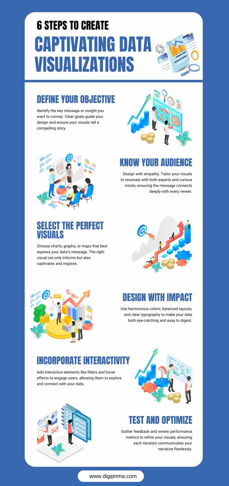
6 Essential Steps For Captivating Data Visualization—Infographic
Discover the secrets behind transforming raw data into compelling visual stories with this infographic presenting 6 steps for captivating data visualization. Begin by clearly defining your objective to guide your narrative. Then, understand your audience to tailor your design for maximum clarity. Thirdly, select the most appropriate format, whether it be bar graphs, line charts, or heat maps, to highlight key insights. Later, focus on impactful design using harmonious colors and clear typography. Lastly, enhance engagement with interactive elements that invite deeper exploration and continuously test and optimize your visuals for clarity and impact.


You can adjust your cookie preferences here.